Blocks Field
Table of Contents
This is an advanced-use feature, and likely not something you'll need to configure. What you probably want is the content types reference!
The Blocks field represents a list of items, similar to the Group List field, but allows each entity in the list to have a unique shape.
For an in-depth explanation of the Blocks field, read our "What are Blocks?" blog post. To see a real-world example of Blocks in use, check out the Tina Grande Starter.
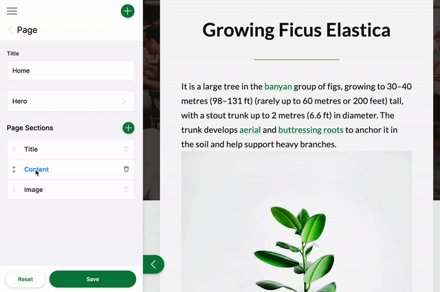
In the gif above, you see a list of Blocks: Title, Image, and Content. The form for this field could be configured like this:
const PageForm = {label: 'Page',fields: [{label: 'Page Sections',name: 'rawJson.blocks',component: 'blocks',templates: {'title-block': TitleBlock,'image-block': ImageBlock,'content-block': ContentBlock,},},],}
/*** Block template definition for the content block**/export const ContentBlock = {label: 'Content',key: 'content-block',defaultItem: {content: '',},fields: [{ name: 'content', label: 'Content', component: 'textarea' }],}
The source data for the ContentBlock might look like the example below. When new blocks are added, additional JSON objects will be added to the blocks array:
{"blocks": [{"content": "**Billions upon billions** are creatures of the cosmos Orion's sword cosmic fugue at the edge of forever science?","_template": "content-block"}]}
Blocks Field Options
import { Field } from '@tinacms/core'interface BlocksConfig {name: stringcomponent: 'blocks'label?: stringdescription?: stringtemplates: {[key: string]: BlockTemplate}}
| Option | Description |
component | The name of the plugin component. Always 'blocks'. |
name | The path to some value in the data being edited. |
label | A human readable label for the field. Defaults to the name. (Optional) |
description | Description that expands on the purpose of the field or prompts a specific action. (Optional) |
templates | A list of Block templates that define the fields used in the Blocks. |
Block Template Options
interface BlockTemplate {label: stringkey: stringfields: Field[]defaultItem?: object | (() => object)itemProps?: (item: object) => {key?: stringlabel?: string}}
| Option | Description |
label | A human readable label for the Block. |
key | Should be unique to optimize the rendering of the list. |
fields | An array of fields that will render as a sub-menu for each group item. The fields should map to editable content. |
defaultItem | A function to provide the block with default data upon being created. (Optional) |
itemProps | A function that generates props for each group item. It takes the item as an argument. (Optional) It returns an object containing, key: This property is used to optimize the rendering of lists. If rendering is causing problems, use defaultItem to generate a new key, as is seen in this example. Feel free to reference the React documentation for more on keys and lists. label: A readable label for the new Block. |
This interfaces only shows the keys unique to the blocks field. Visit the Field Config docs for a complete list of options.
Product
Showcase
TinaCloud
Introduction
How Tina Works
Roadmap
Resources
Blog
Examples
Support
Media
Whats New
TinaCMS
TinaCloud
Use Cases
Agencies
Documentation
Teams
Jamstack CMS
Benefits
MDX
Markdown
Git
Editorial Workflow
Customization
SEO
Comparisons
TinaCMS vs Storyblok
TinaCMS vs Sanity
TinaCMS vs DecapCMS
TinaCMS vs Contentful
TinaCMS vs Builder.io
TinaCMS vs Strapi
Integrations
Astro
Hugo
NextJS
Jekyll
© TinaCMS 2019–2024